
Over three years at LiveLike, I led the design and evolution of our flagship rewards interface — used by clients like the YES Network, the New York Mets, and LIV Golf, and now forming the basis of an upcoming rollout with some of the world’s most prominent sports organizations. What began as a minimal launch has since grown into the modular, future-proof dashboard used for all clients.
The Starting Point
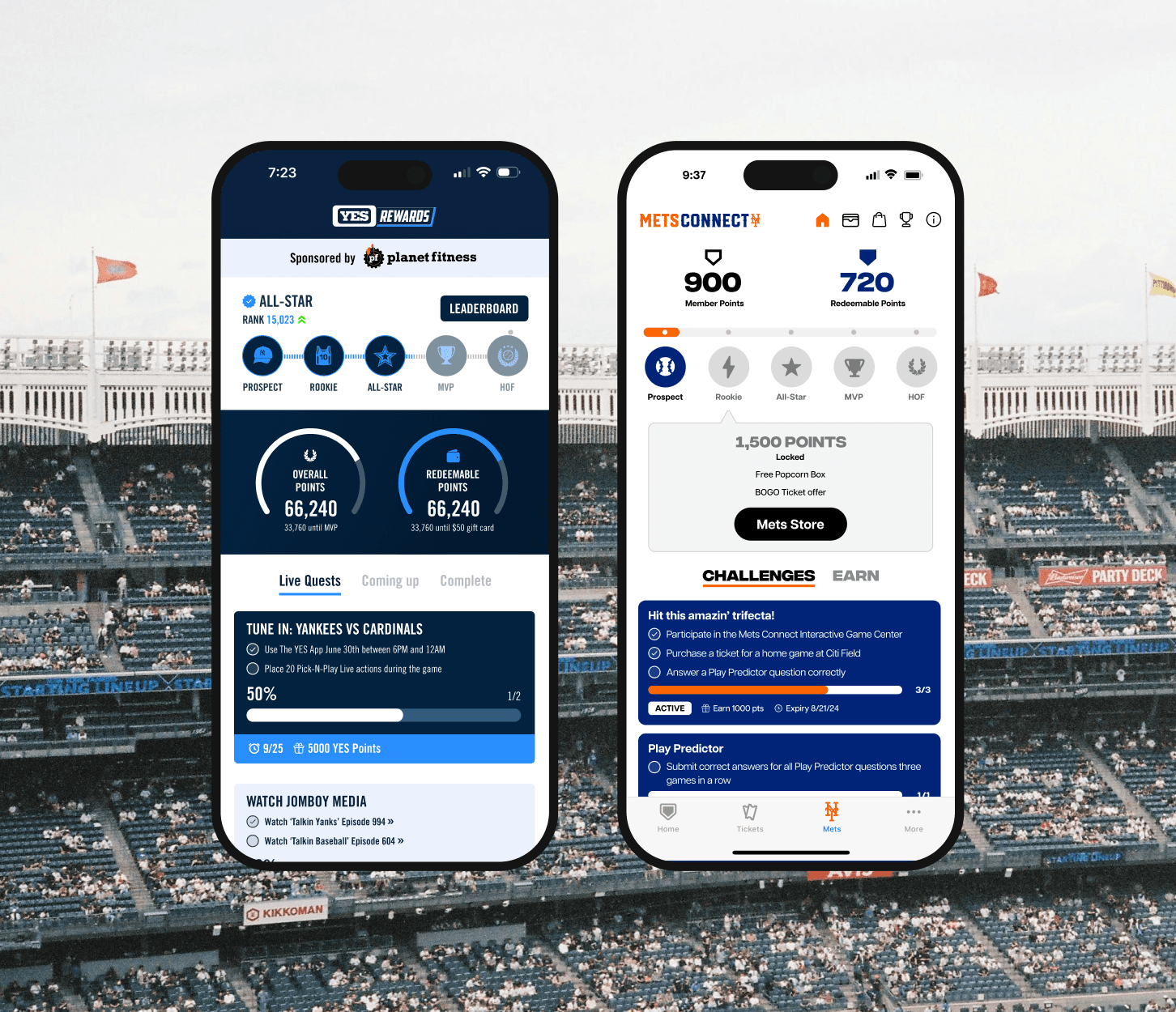
In 2023, we launched the first version with YES Network — integrating LiveLike’s points and tier system with their CDP via mParticle, and introducing Quests to reward specific user actions. The design was sparse, but effective. It proved that incentivized behavior could drive measurable engagement, and laid the groundwork for future builds.
Enter the Mets
When the Mets came onboard, the requirements expanded. They wanted a full rewards store with physical items, integration into the MLB Ballpark app, and close collaboration between multiple teams — theirs, ours, and a third-party CMS provider. We agreed to a six-week turnaround. I led the UI design and system structure, mapping rewards into the CMS, designing the store, and shipping what became Mets Connect 1.0. The launch was a hit and gave us the confidence to use this as the blueprint for future clients.
Forecasting the Breakdown
As we continued rolling out variants of this UI — for LIV Golf, new Mets programs, and others — cracks started to show. Each client had slightly different needs. The product itself was growing too, with new features like games, social layers, and leaderboards. These additions were handled piecemeal, often driven by individual client requests, and it became clear that the interface wasn’t built to scale in a clean, coherent way.
The information architecture was already drifting, and I could see it starting to create problems. Engagement metrics were beginning to flatten, clients were flagging usability issues, and internal QA was surfacing signs of friction. I saw the direction it was heading and decided to address it before it compounded.

The Redesign
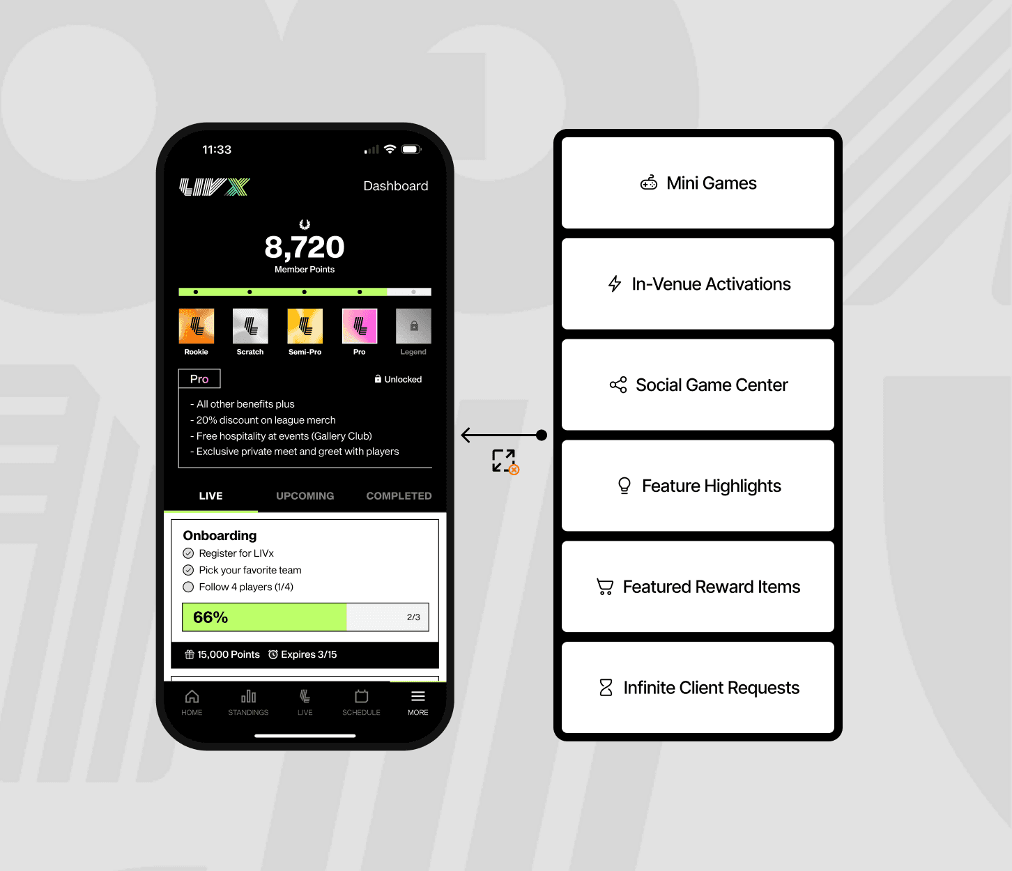
I pitched a modular redesign — unprompted — to leadership. The goal was to preserve consistency across clients while still accommodating different content and feature sets. The new design introduced a flexible tab system below a consistent rewards header, allowing clients to add or reorder modules without compromising the core UX.
The idea was simple: say yes to every client without saying no to the UX. Much of what made that possible came from work already in flight — new mini games, an improved rewards store, upgraded CMS tools — designed by my team. I provided the overarching design direction to bring those evolving pieces into a single, coherent system.
The Mets adopted the redesign as Mets Connect 2.0 and expanded its use to their season ticket member portal. LIV followed shortly after. It’s now the default dashboard pattern for every new rewards client — and is about to roll out across some of the biggest sports teams in the world.
My Role
Led all product design from the original YES Rewards MVP through to the modular redesign
Designed and shipped the Mets’ rewards store and dashboard UI in under six weeks
Proposed and architected the unified system model adopted by top-tier clients
Directed a multi-team rollout across internal designers, devs, vendors, and stakeholders
Impact
Over 1M+ monthly active users on the dashboard
Deployment timeline reduced from months to under 2 weeks
Proven ability to influence behavior (e.g. 50%+ lift in VOD engagement through quest design)
Now the centerpiece of every new business demo, driving multimillion-dollar contracts