
When I joined LiveLike, there was no design system. No design culture, really. Just three designers — all remote, all on different scrum teams, all working in isolation. The CMS was a powerful product, but visually and structurally, it was a mess: different colors, icons, text styles, and components on almost every screen. I found over 50 unique button styles.
I was hired as the first product design lead and immediately focused on building a foundation. I aligned the team, established rituals, and embedded myself in the product to understand what needed fixing. The CMS was sprawling and enterprise-level, but had zero shared logic. It was clear: before we could improve features, we had to create a system that could support them.

Phase One: The First Attempt
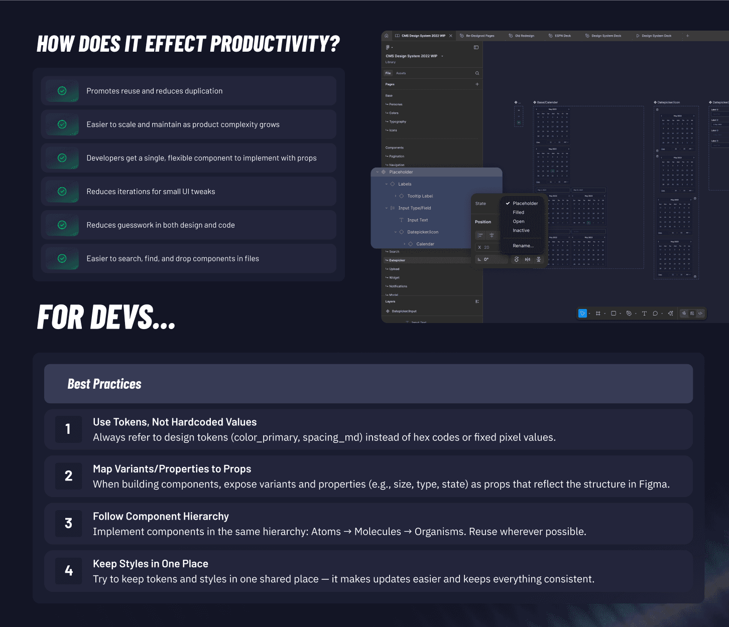
The first version of the design system began with a massive Figma audit. We catalogued every component, refactored visuals, rebuilt type, color, iconography, and element-level patterns. I led the effort and directed a junior designer through the construction — it was their first time doing this kind of work, and it was a major growth moment.
This was before tokens were widespread and before auto-layout was fully matured. In hindsight, it wasn’t truly atomic — but at the time, it felt like progress. We launched five features with the new system and began building new ones with it as well. A dev team was tasked with iterative implementation.
And then the bottom fell out.
Layoffs paused the rollout. Features were half-in, half-out. New designs lived next to legacy ones, creating a worse experience than before. With no resources and no mandate, the system went dormant. It was my worst-case scenario — visual inconsistency with the added sting of knowing how close we’d come.
Phase Two: The Reboot
By 2025, the need for a second attempt was clear — and this time, we were ready. We brought on a designer with a deeply systems-oriented brain and committed to rebuilding the design system from scratch. This time it’s done right:
Fully tokenized
No inline styles
Modular, atomic components
Scalable, semantic naming logic
Proper design-engineering collaboration from day one
But more importantly: the org is aligned this time.
Selling the System: The Roadshow
We treated the relaunch like a campaign. I created a series of internal “summits” — one for each key group: senior engineers, front-end devs, product owners, the design team, leadership. Each had its own focus and language. We didn’t just present the system; we framed its value through their lens.
Internally, we jokingly called it “The Roadshow,” but it worked. What changed between v1 and v2 wasn’t just the component structure — it was the buy-in.
And we earned that buy-in. Over the past three years, design went from an afterthought to a core part of product planning. That shift made the second attempt possible.
My Role
Assessed and documented the existing design chaos across the CMS
Led the first full design system build in Figma, from audit to implementation
Mentored and directed junior designers through system construction
Partnered with engineers to pilot early features in the new system
Learned from rollout collapse and restructured design advocacy
Created and led the 2025 design system “Roadshow” to secure cross-org alignment
Supporting and guiding the new system designer through atomic-level rigor and rollout strategy
Outcome
The system is now live, mid-rollout, and actively in use. Implementation is clean, feedback is strong, and teams are aligned. This time, the wheels are on — and they’re not coming off.